
Changed + Fed
Mobile App Design

COMPANY
Private Client
ROLE
UX Designer
DATE
2016
BRIEF
Create a mobile location services app to help parents and caregivers find places where they can feed and change their little ones on the go.
Caring for a child, especially an infant or toddler, can be quite challenging as it is. Scheduling appointments, prepping meals or packing an entire travel bag just to go to the grocery store, it’s evident that moms, dads, guardians, nannies and caretakers of any sort face multiple challenges on a daily basis.
One in particular happens to be the challenge of not always knowing where to go to change or feed a baby outside of the home. This is where Yumiko Sasakawa and Julia Lemeiux (two first time mothers) were inspired to make change that could positively impact the community and help solve that issue for the baby caretakers of Vancouver.
Parents and caretakers prefer to plan ahead. They want to know in advance if their destination will have changing and nursing facilities available.
In the case of an emergency or unexpected situation, the caretaker just wants to know where the closest location is, what is available there and that it is clean and safe
Research
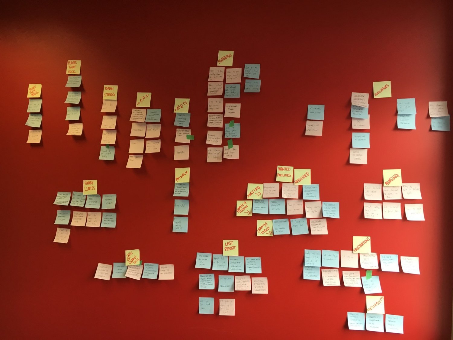
Competive Analysis

We knew there wasn’t much for direct competition in Vancouver, but wanted to see what other popular location services were providing that we could improve and personalize for our users.
Feature Bloat — Although we loved the plethora of options to customize and explore, we knew our users would feel lost and frustrated trying to use too many complicated features.
Significant Iconography — We loved the unique iconography that some of the apps had. We knew we wanted to create something visually concise and learnable.
The ‘Thumb Stretch’ — With our specific users in mind, we wanted to step outside of the standard layout of these location services apps and shift around the prominent features to make Changed + Fed as easy and efficient to navigate as possible.
Adding a C+F Location — We realized that our app would be user centric and needed a strong community to keep up the database. We loved that some of the apps had the option to be a part of giving back to the community and wanted our users to have the same opportunity. With this in mind, we implemented an “add location” option for users to include places that Google maps missed.
Planning
We knew the basic navigation of the app but wanted to add some extra functionality without over inflating Changed + Fed with any unnecessary features. Again, the goal was to keep the app as simple, quick and easy to use as possible. Reviewing our user flow, we referred back to our research to determine all the possibilities and which ones were most important.

Results
We wanted to make sure that we were always on the same page before getting pen to paper so we would break out into 5 minute sessions individually white-boarding our ideas and brought them together to form our first round of sketches.
Our key findings from this design method was the floating UI element of implementing a swipe-able card throughout the app. We also wanted to solve the challenge of the one handed (baby holding) user and decided it made sense to move the search and filter navigation to the bottom of the screen where it is easiest to access.
Testing & Iteration
Our biggest challenge was determining how we were going to execute the ‘rating’ system without stars, faces, or numbers and ensuring that it is clear enough.
We began our testing on a simple wireframe of our first version where we discovered that our users did not understand the swiping of the rating screen or how to confirm their experience.
It was during this time that we also discovered that users were not able to easily identify that the numbers above the rating status icons, signified how many people had rated and decided to implement a simple “traffic light system” to show Green for Good, Amber for Satisfactory, Red for Bad.