
Vessi Footwear
Global Navigation Redesign
Vessi Ltd. is a Vancouver based startup that began with only an online eCommerce platform. As the company began to grow, they wanted to see UX improvements and convert more customers.
As the Lead Senior Product Designer at Vessi, I was tasked with doing an audit of the current site and making incremental improvements. During my time, I also began a design system for the company.
COMPANY
Vessi Footwear
ROLE
Senior Product Designer
DATE
2022-2023
BRIEF
Optimize global navigation to improve user experience, include more styles and increase conversion.
I began conducting my research by mapping out the current flow and analyzing the E2E experience. From there I looked at competitors to identify common themes across retail sites and other large brands with a robust global nav. The current experience had a lot of pain-points that we could improve right away:
Research
Not mobile friendly
Difficult findability
Missing ‘View All’
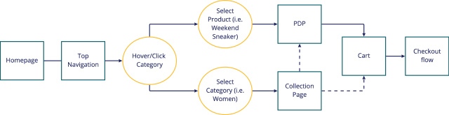
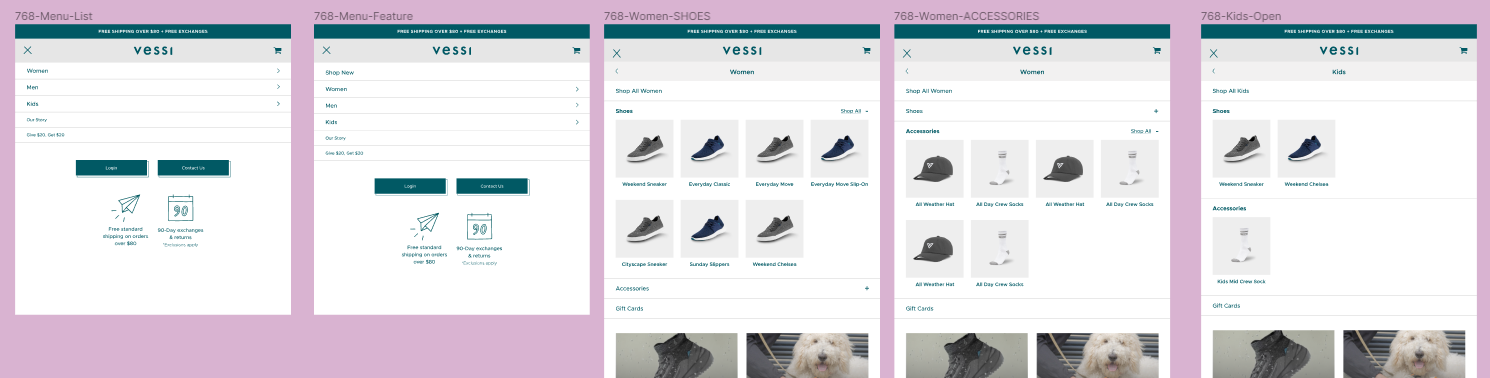
CURRENT FLOW
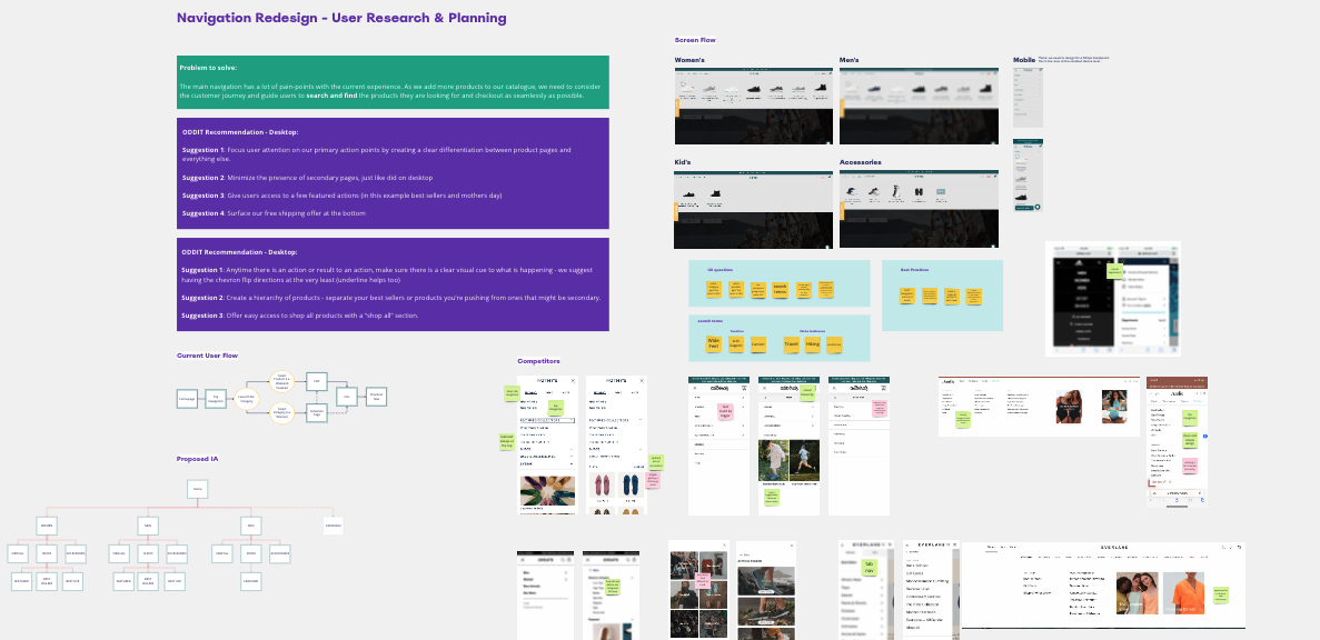
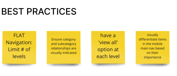
The main navigation had a lot of pain-points with the current experience. As we added more products to our catalogue, we needed to consider the customer journey. The goal was to guide users to search and find the products they are looking for and checkout as seamlessly as possible.
Problem
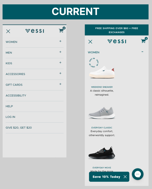
The current state of the navigation offers users accordion like dropdown menus for each category. This experience is clunky, tedious and difficult to navigate. Finding a product takes twice as long as competitors and as we add more to the product catalog, this issue will only get worse.
I knew I wanted to test out a couple versions to ensure we were implementing the best interaction design. I began by designing two versions of wireframes and did some rapid prototyping. This gave me the flexibility of testing this in person on a mobile device.
Planning
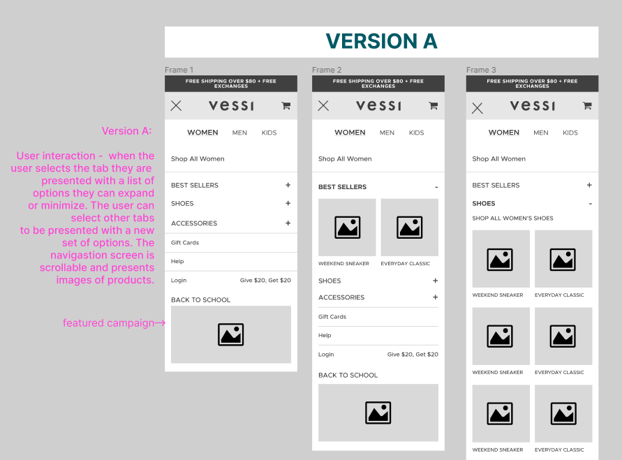

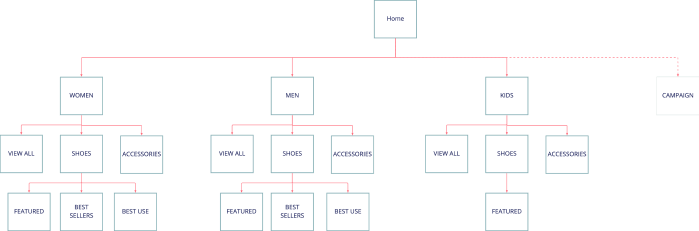
PROPOSED IA
Usability Testing Findings
Some users missed the tabs completely
Users didn’t understand sub categories
Users wanted to see full list of products upfront
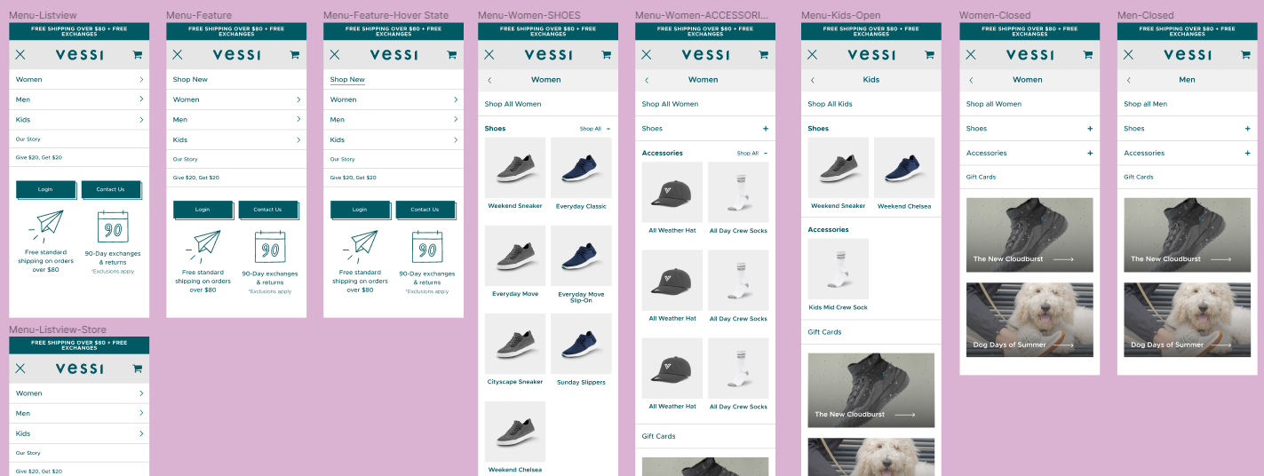
Usability testing showed that users wanted clear categories, fewer clicks and some suggestions in the feature section. Ultimately I ended up iterating on the final version and combing designs to produce the best user experience.
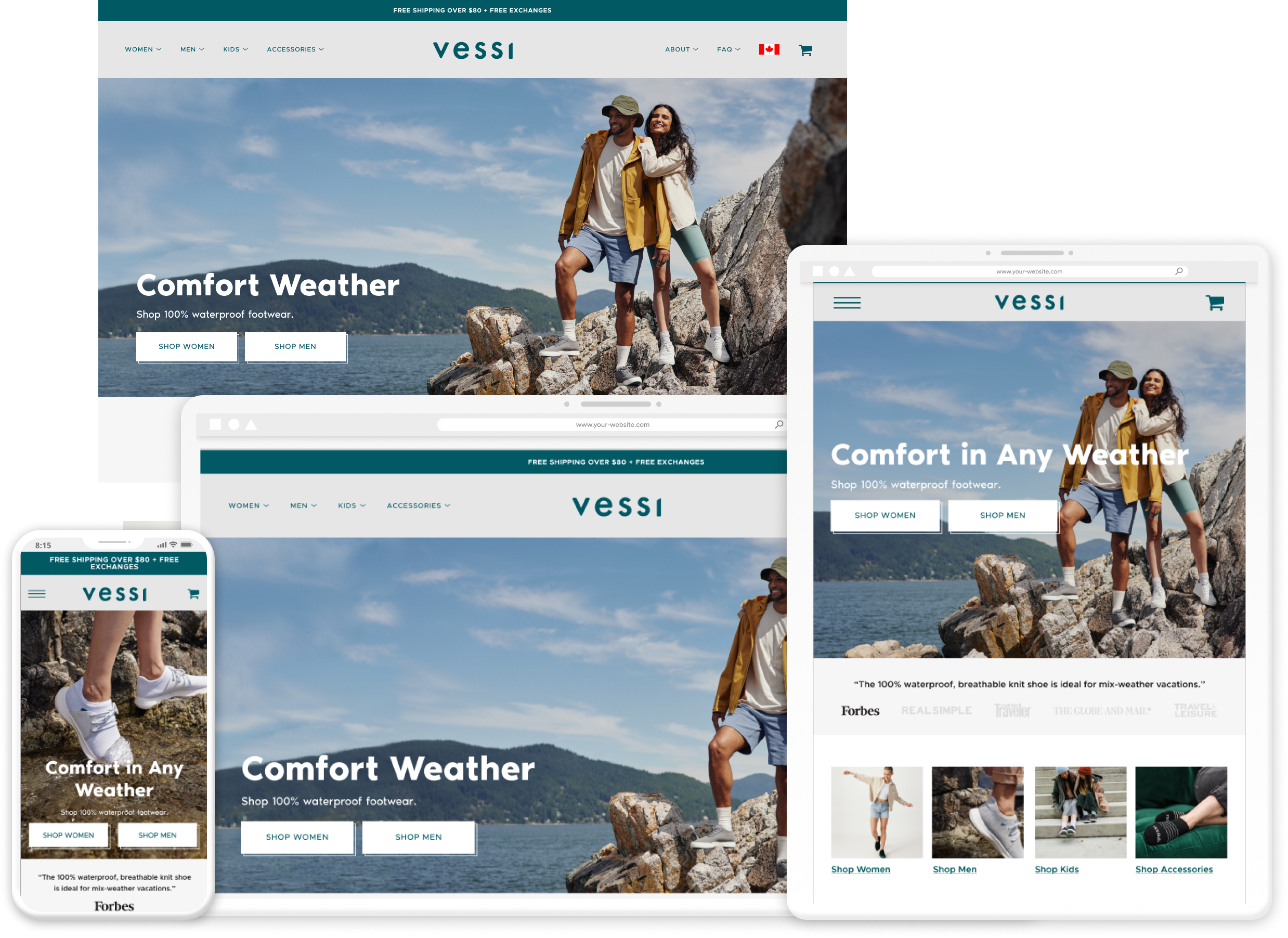
Stakeholders were pleased with the minimal, easy to use navigation updates. Within the first week we saw a conversion increase of 6%. I partnered with CX and customer feedback was positive. My Global Navigation Design I created is on the Vessi site.
Result
MOBILE FLOW
TABLET FLOW
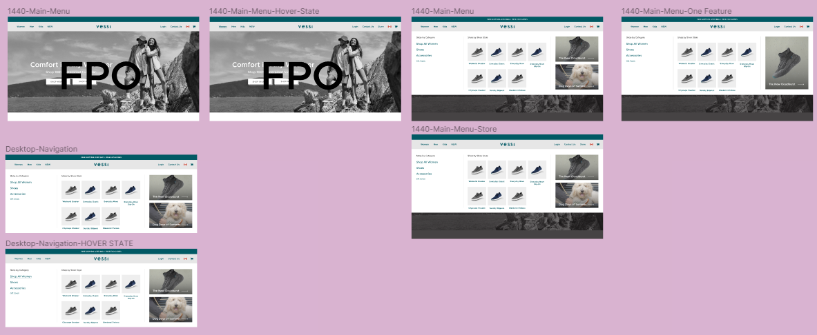
DESKTOP FLOW